

SETTING SON RECORDS.
Client — Setting Son Records
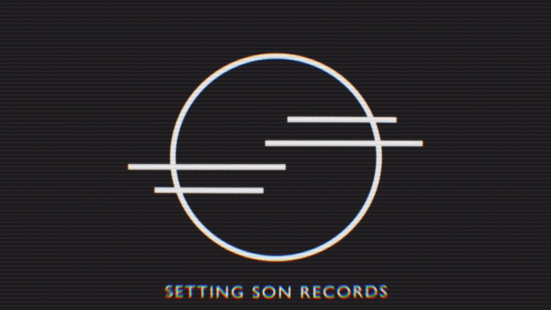
Visual identity / logo design for Setting Son Records — May 2020. The logomark reflects both a sun setting and partially obscured by clouds and the double S alliteration of the label’s name. Throughout the identity Gill Sans has been used to reflect the extensive use of the typeface on the classic Decca, EMI and Parlophone record sleeves and liner notes of the 1960s to establish the label as being in that same lineage of British labels and to evoke the romance associated with rock and roll releases of that era.
Logo design in motion for Setting Son Records — May 2020. The double lines that run through the centre of the logomark transition from sound waves before separating to become clouds partially obscuring a setting sun and to imply the letterforms of the double S alliteration of the label’s name.

Setting Son Records August 2020 Mixtape — August 2020. Application of the label identity across social media assets for monthly Spotify playlists curated by Echoes of the City.

Setting Son Records July 2020 Mixtape — July 2020. Application of the label identity across social media assets for monthly Spotify playlists curated by Echoes of the City.

Setting Son Records June 2020 Mixtape — June 2020. Application of the label identity across social media assets for monthly Spotify playlists curated by Echoes of the City.

Setting Son Records May 2020 Mixtape II — May 2020. Application of the label identity across social media assets for monthly Spotify playlists curated by Echoes of the City.